Key Takeaways
- Colour in luxury design is a tool for emotional storytelling and depth, not just surface decoration.
- The way hues are paired (tone, texture, context) matters more than simply picking a “popular” colour.
- Boldness, when applied with intention (as in black, or strong blues) can elevate a space from generic to personal and impactful.
Humans have a natural, instinctual reaction to color. Of course, our preferences may be based on our own childhood experiences or cultural influences, and may change over time, but the power of color cannot be underestimated. There have even been studies observing neural reactions to different colors. Let’s ponder some of the rainbow’s hues and the possibilities they hold in our homes.
Red
Red is seen as a positive, stimulating color that stirs up passion and energy in those who see it. Conversely, it can be seen as an aggressive color, so it should be used with a specific intention. In Asian cultures it is considered good luck! And it’s always nice to add a bit of drama to liven up a space.
Pink
Red’s little sister is pink. This is considered more feminine, at least in spaces, not necessarily in fashion any more. When it’s a bit more saturated, it becomes fuchsia, which is considered more of a power color. It is interesting, however, to know that studies show that pink can be calming for around 30 minutes then make someone irritable for around 30 minutes and back to calm.
When Pantone, the world’s authority on color announced Living Coral as the color of the year, I knew a neutral base would be the best way to showcase this bright hue, which is a warm, peachy orange with gold undertones. If you are going to use a trendy color, I suggest accessorizing with it so you can replace it when it feels dated. For a larger impact, go ahead and paint a wall. The right paint color can completely transform a space and it’s so easy and inexpensive to redo, so don’t be afraid!
Yellow
I have grown to absolutely love yellow myself. It is a cheerful and positive color that brightens a dark space and brings in that feeling of sunshine and happiness. I do notice that clients tend to shy away from it because it is a strong color and it takes some convincing to understand how to use it. Just like Van Gogh’s Lilies focuses on the blues of the flower, they would not stand out the way they do if it weren’t for the yellow. Appropriate use of color is not just the use of one color but the way in which colors—and even textures—combine to create an overall aesthetic.
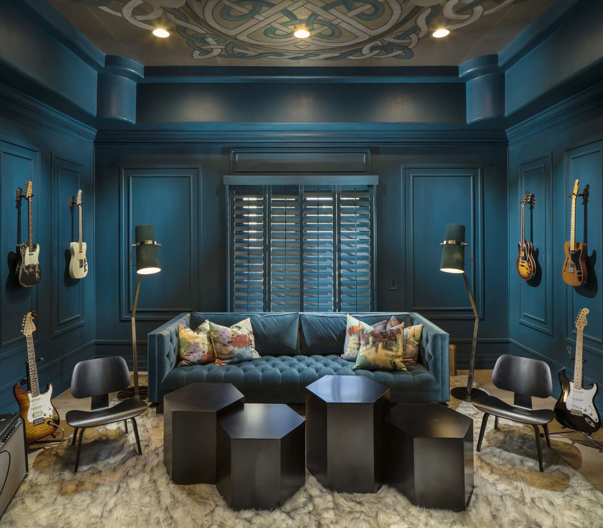
Blue
Blue is another favorite for interior spaces. It reminds us of the ocean, the sky; nature in general. Clients find that to be exceptionally restful. Blue is considered to inspire trust and safety. That’s why lots of banks and even politicians use it frequently. When the tone becomes a spa blue, it really comes across as a peaceful respite from the hectic world.
Purple
Purple and fuchsias are traditionally the color of royalty and majesty, and symbolize opulence and luxury. I find my clients either love it or hate it! When mixed with dusky neutrals, it has the ability to transform spaces overflowing with sophistication and luxury.
Neutral Shades
Then we have neutrals, which I have noticed typically polarize my clients into either warm or cool contingencies. I love the subtle tension created by blending the two, which adds more depth to a space.
Grays have saturated the decorating market for the last few years. I like to counter this fad-like following by using more sophisticated tones of grey such as truffle or mushroom. It’s classic and plays well with any accent desired.
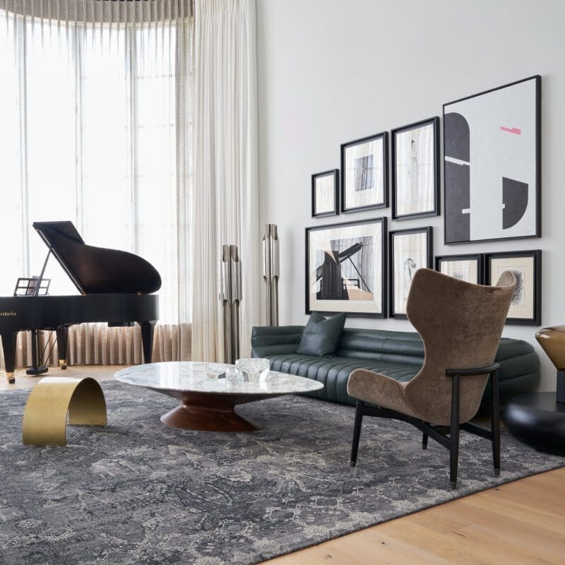
White
My most favorite color, or noncolor, is white. White reflects all light waves so technically it’s an all-color. I find it to be very sophisticated, as it relies on the use of other design principles to make it a strong design. When the palette takes a back seat to design, you notice texture, scale, balance and other more complicated design elements to carry your aesthetic statement.
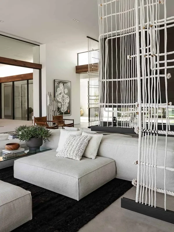
Black
And then we have black—the color of Manhattan, pure sophistication and sexiness. Strong and bold, everything is sleeker and more fabulous in black.
The main story here is to open your mind and explore some new ways to express yourself. Go ahead and be bold! Watch as colors you never before imagined, transform your space in a way you love.
FAQs
- How can a homeowner use colour to express mood without overwhelming a space?
Start with one dominant or meaningful hue and pair it with supportive neutrals. By balancing bold colour with subtle materials or finishes you maintain visual impact without creating visual fatigue.
- Why does the article emphasise white as a “non‑colour” and favourite of the designer?
Because white reflects all light and thereby allows other design elements, texture, scale, materials, architectural volume, to take prominence. It gives a clean, sophisticated backdrop where subtler details become visible and meaningful.
- How should a designer or homeowner think about black to avoid it feeling heavy or oppressive?
Use black as an accent or framing element rather than covering entire rooms, think of black in trims, furniture, contrast. Its power and drama shine when paired with lighter hues and textures so you get sleekness without gloom.
- Are the meanings or feelings evoked by colours universal?
Not entirely. While some emotional responses (calmness from blue, drama from black) are common, individual history, culture, lighting and material context change how we perceive colour. It’s important to test and experience a palette in the actual space.
- What’s the biggest mistake people make when selecting colour for luxury interiors, according to the article?
One major mistake is treating colour as decorative afterthought rather than emotional driver, choosing something because it’s safe or trendy rather than because it resonates with the client’s story, space and intention.